Module 2: Population Structure & PCA
Visualizing genetic relationships
What is Population Structure?
Population structure means that individuals in your dataset are not randomly related — some are more similar to each other than to others.
This happens because of:
- Geographic separation — Plants from different regions evolved separately
- Breeding history — Different breeding programs created different genetic groups
- Species/subspecies — Mixing samples from related species
Why Does It Matter for Breeding?
Population structure affects almost every genomic analysis:
| Analysis | How structure affects it |
|---|---|
| GWAS | Can cause false positives — structure looks like trait association |
| Genomic selection | Models may not work across populations |
| Diversity estimates | Mixing populations inflates diversity |
Always check population structure before running GWAS or genomic prediction.
What is PCA?
PCA (Principal Component Analysis) is a way to visualize high-dimensional data in 2D or 3D.
The Intuition
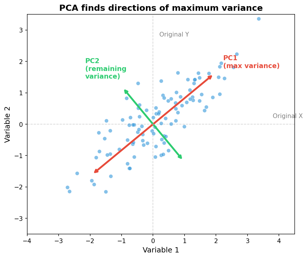
Imagine you have 5,000 SNPs. Each sample can be thought of as a point in 5,000-dimensional space. We can’t visualize that!
PCA finds the main axes of variation and projects everything down to 2 or 3 dimensions while preserving as much of the structure as possible.
Reading a PCA Plot
Each dot is one sample. Samples close together are genetically similar.
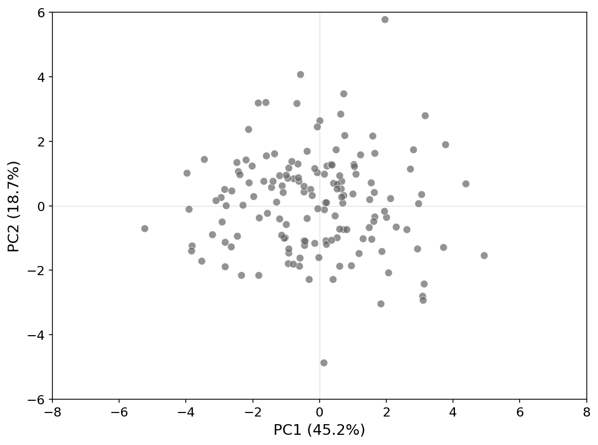
In this example: - Two clear clusters → likely two genetic groups - Samples in between → possible hybrids or admixed individuals - Outliers → check for mislabeling or contamination
Running PCA in BIGapp
Demo: PCA Analysis
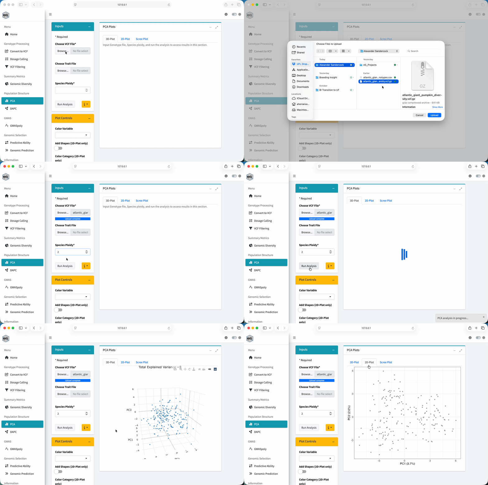
Watch how to run PCA:
Steps:
- Go to “PCA” in the sidebar
- Upload your VCF file (
atlantic_giant_pumpkin_diversity.vcf.gz) - Click Run PCA
- Explore the interactive plot
Understanding the Output
BIGapp gives you:
- Interactive PCA plot — Hover over points to see sample IDs
- Variance explained — How much information each PC captures
- PC loadings — Which SNPs contribute most to each PC
Try It Yourself
- Run PCA on your filtered pumpkin data
- Look at the plot — do you see distinct clusters?
- Check the variance explained — how much does PC1 capture?
With the pumpkin dataset, you should see three overlapping clusters corresponding to the Eastern, Midwest, and Western US breeding regions. The clusters overlap because there’s been gene flow between regions — this is realistic for most breeding populations!
Interpreting Your Results
Scenario 1: Clear Clusters
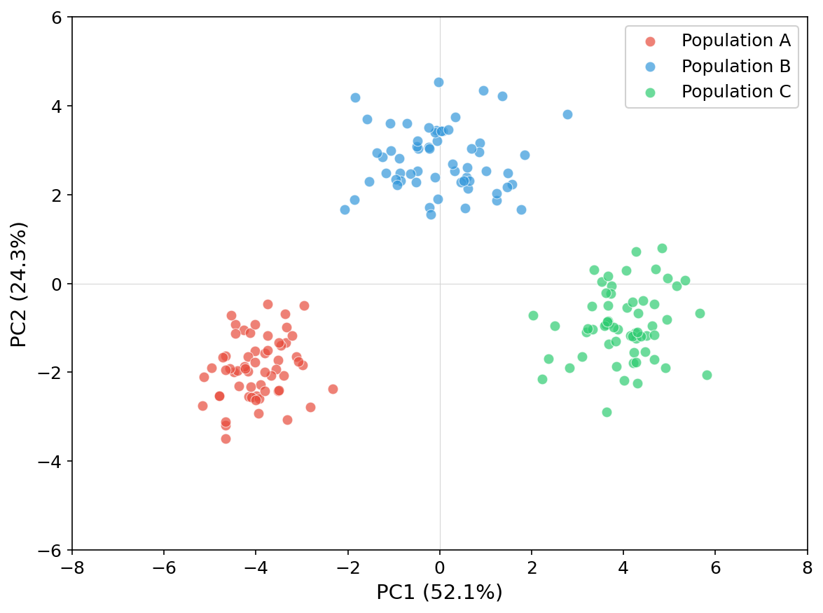
What it means: Your data contains distinct genetic groups.
What to do: - Consider whether to analyze groups separately - Account for structure in GWAS (BIGapp does this automatically) - For genomic selection, training within groups usually works better
Scenario 2: Continuous Variation
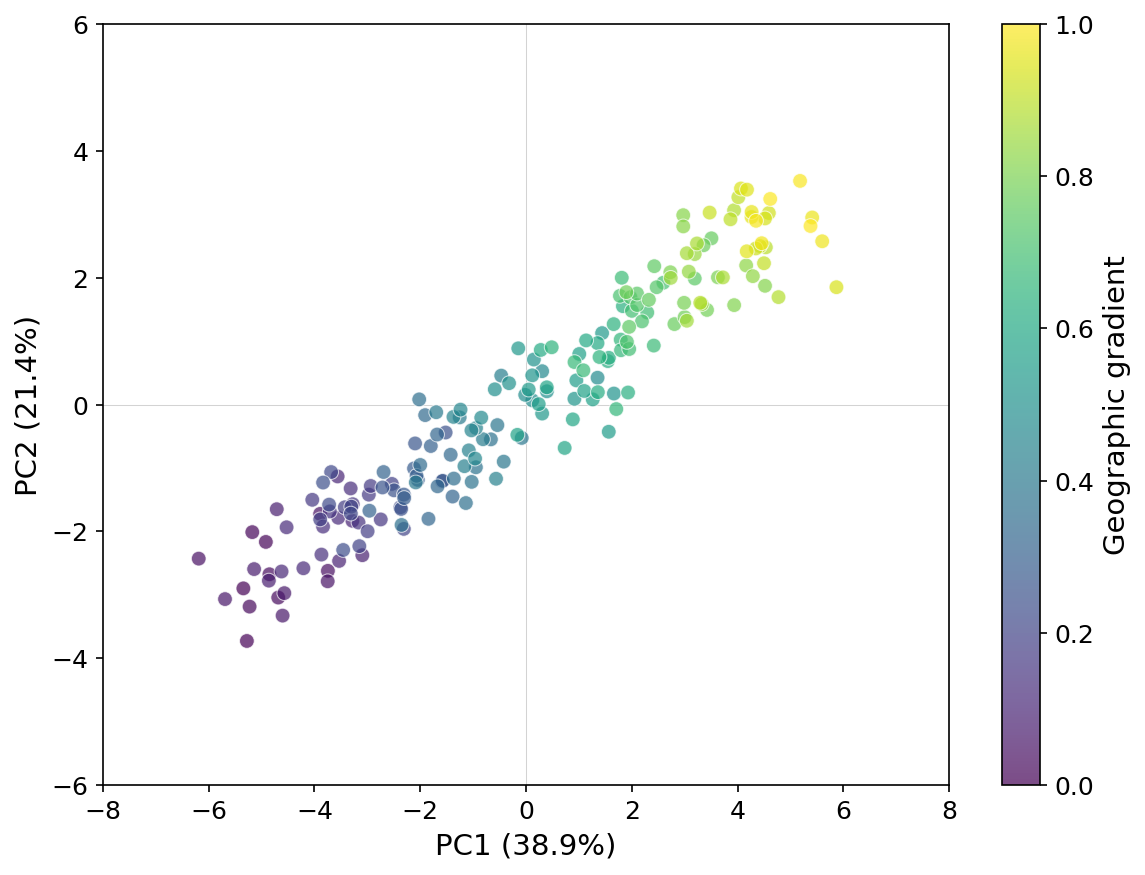
What it means: No strong substructure — samples vary along a gradient.
What to do: - This is often ideal for genomic prediction - GWAS should still include PCs as covariates
Scenario 3: Outliers
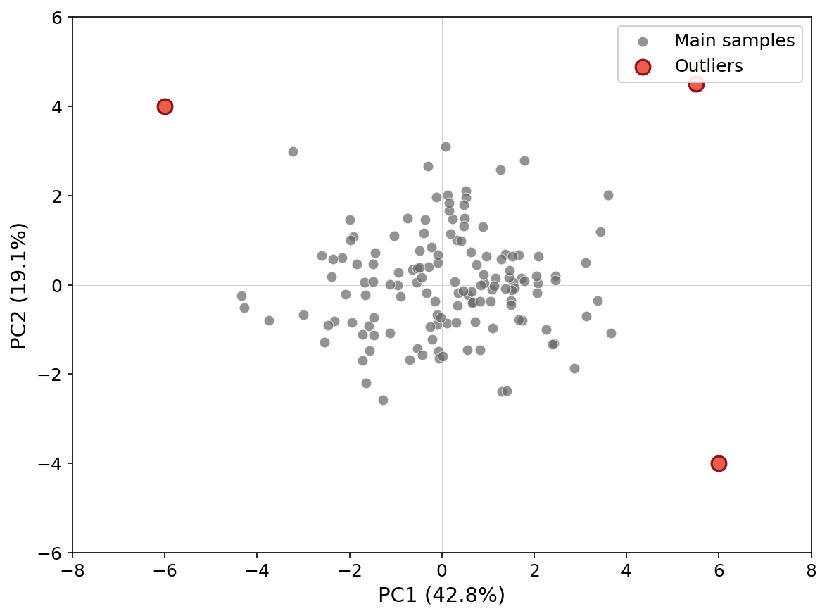
What it means: Some samples are very different from the rest.
What to do: - Check sample labels — are these mislabeled? - Check DNA quality — did something fail? - Are these a different species/variety? - Consider removing or analyzing separately
Coloring by Groups
If you have metadata (population, breeding program, location), you can color the PCA:
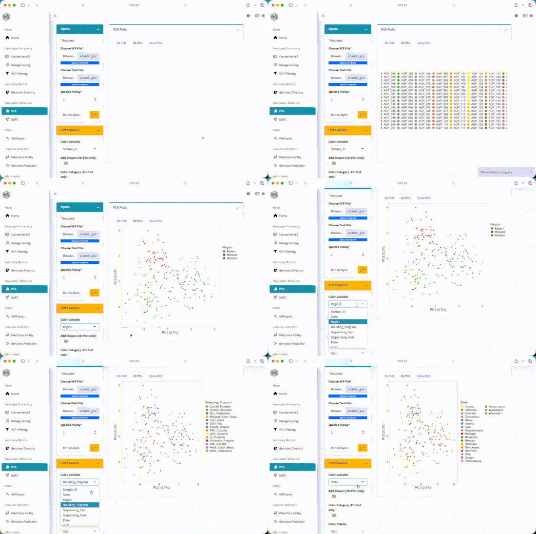
This helps you see if genetic structure matches your expectations.
Steps:
- Upload the phenotype file (
atlantic_giant_pumpkin_diversity_phenotypes.csv) - In the PCA section, select Region as the grouping variable
- The plot updates with colors — you should see Eastern, Midwest, and Western clusters!
Color by State to see a finer geographic gradient, or by Breeding_Program to see how programs cluster genetically.
How Many PCs to Use?
Look at the scree plot — it shows how much variance each PC explains.
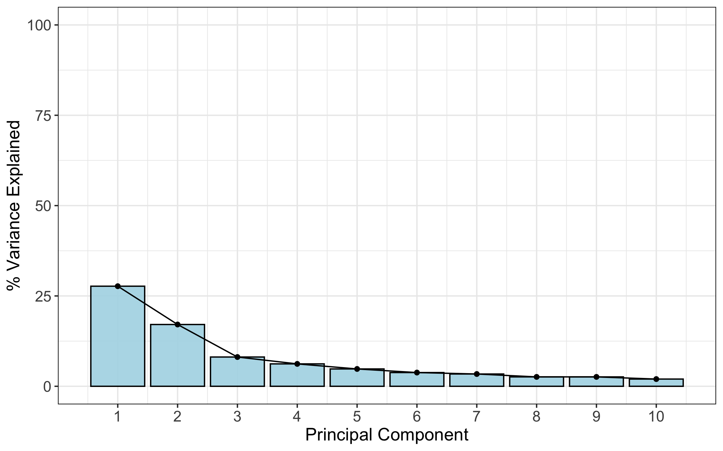
Rule of thumb: Keep PCs until the curve levels off (the “elbow”). Often this is 3-10 PCs.
For GWAS and genomic prediction, BIGapp uses PCs automatically to correct for structure.
DAPC: An Alternative to PCA
DAPC (Discriminant Analysis of Principal Components) is another method for visualizing structure. It’s better at separating known groups.
Use DAPC when: - You already know your group labels - You want to maximize separation between groups - You’re interested in which markers differentiate groups
BIGapp includes DAPC in the same section as PCA.
Exercise
Using your filtered pumpkin data:
- Run PCA
- How many distinct clusters do you see?
- What percentage of variance does PC1 explain? PC2?
- Are there any outliers?
- Color by Region — does genetic structure match geographic origin?
You should see three overlapping clusters that align with the Eastern, Midwest, and Western regions. PC1 typically captures 5-10% of variance in diverse breeding populations. If you color by State, you’ll see a geographic gradient within each regional cluster.
Key Takeaways
✅ Population structure means some samples are more related than others
✅ PCA visualizes this structure in 2D
✅ Clusters = genetic groups; outliers = check for problems
✅ Always check structure before GWAS or genomic prediction
✅ Use PCs as covariates to correct for structure
Next: Module 3: GWAS — Finding marker-trait associations