Module 3: GWAS
Finding marker-trait associations
What is GWAS?
GWAS (Genome-Wide Association Study) scans across all your markers to find which ones are associated with a trait of interest.
The Question GWAS Answers
“Which regions of the genome affect this trait?”
For example: - Which markers are associated with disease resistance? - Where in the genome are yield QTLs located? - What’s the genetic basis of flowering time?
How It Works
GWAS tests each marker individually:
- Group individuals by their genotype at a marker
- Compare phenotypes between groups
- Statistical test — Is the difference significant?
- Repeat for every marker
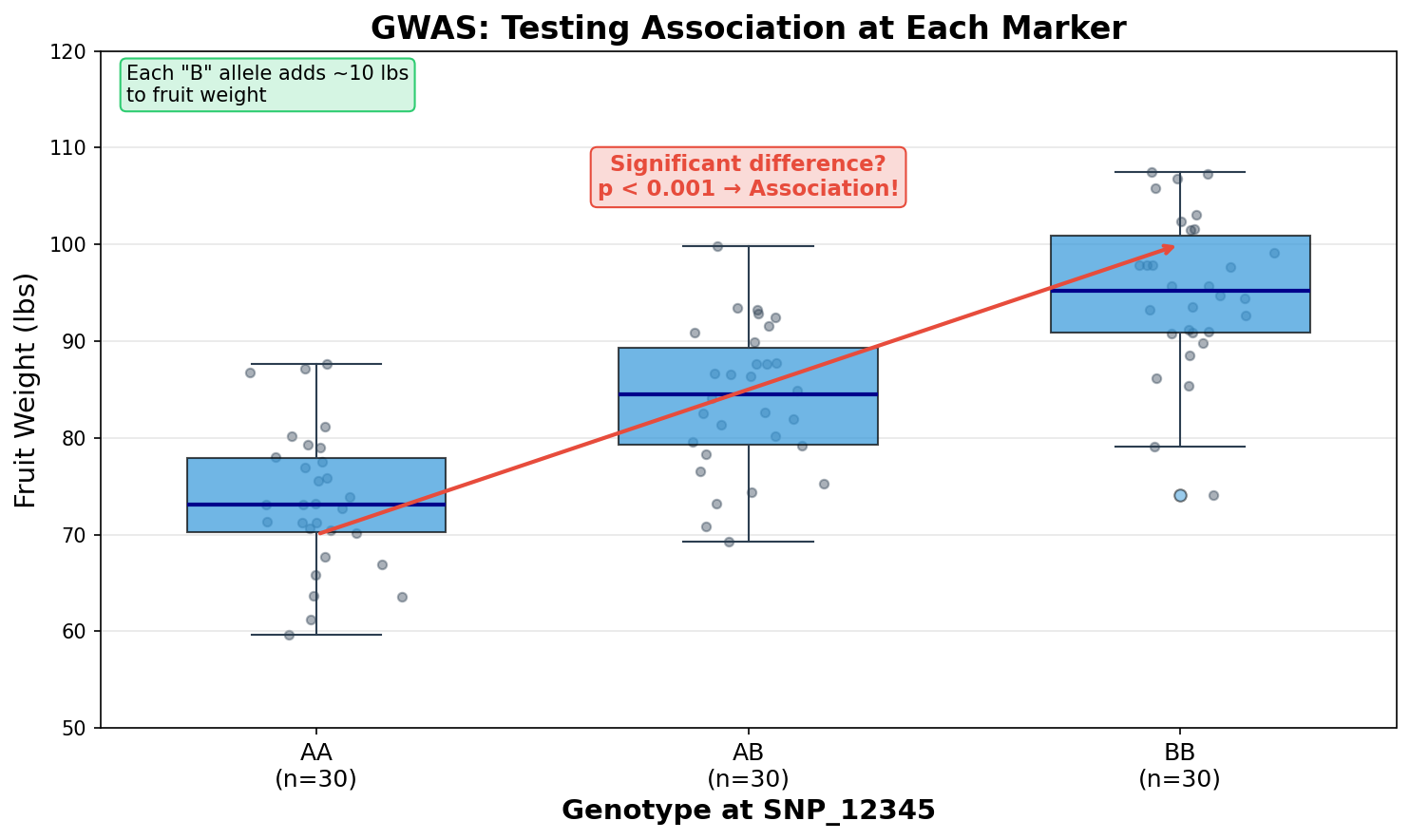
If individuals with allele “B” consistently have higher yield than those with allele “A”, that marker is associated with yield.
The Manhattan Plot
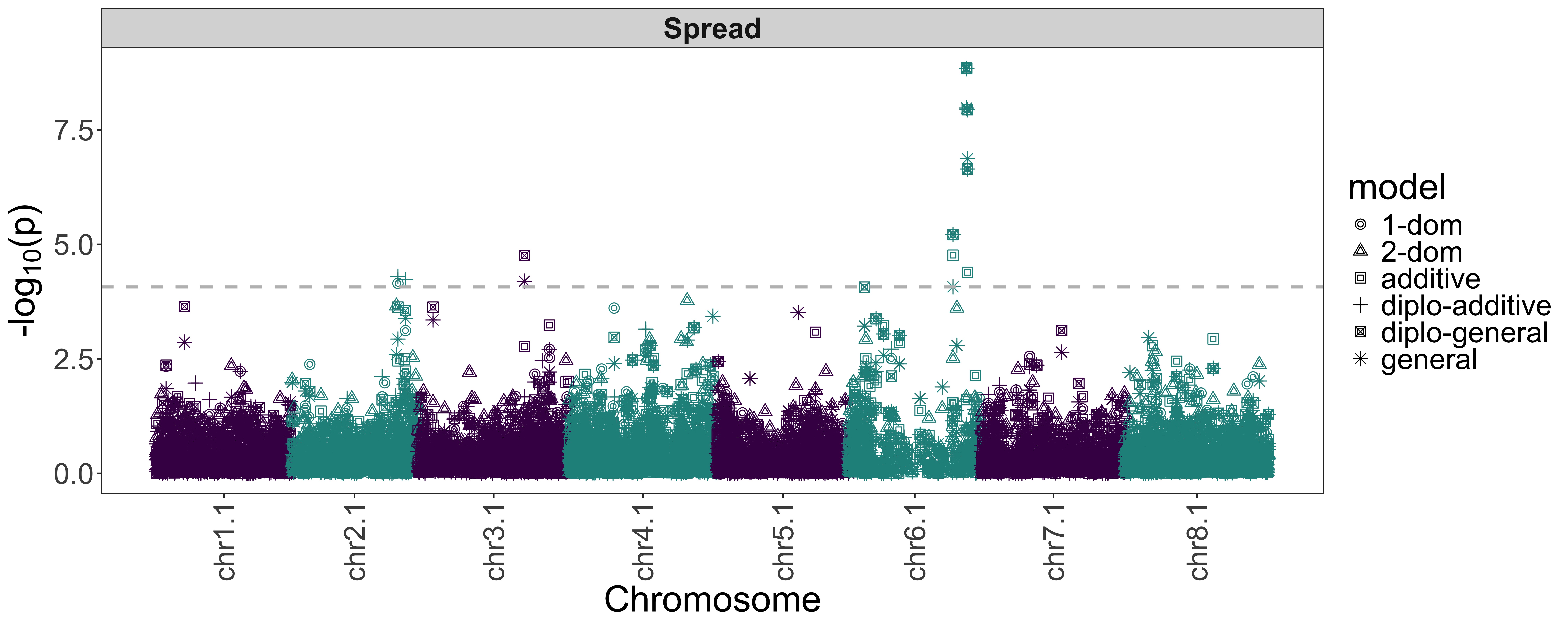
GWAS results are typically shown as a Manhattan plot:
Reading the Plot
- X-axis: Position along the genome (chromosomes shown in alternating colors)
- Y-axis: Significance level (-log10 p-value)
- Peaks: Potential QTLs — markers significantly associated with the trait
- Threshold line: Significance cutoff (markers above this are “hits”)
A p-value of 0.001 becomes -log10(0.001) = 3. Smaller p-values (more significant) become larger numbers, making peaks easier to see.
Why Population Structure Matters for GWAS
Remember the PCA from Module 2? Population structure can cause false positives in GWAS.
The Problem
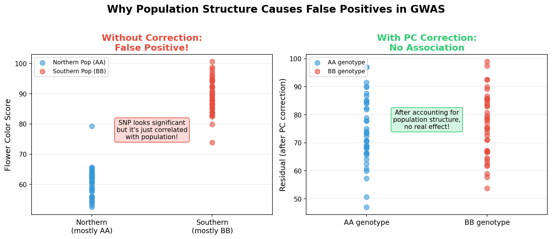
Imagine: - Group A is from the north, has blue flowers, and happens to have allele “T” at SNP_123 - Group B is from the south, has white flowers, and has allele “C” at SNP_123
If you run GWAS for flower color, SNP_123 will look significant — but it’s not actually causing the color difference. It’s just correlated with population structure.
The Solution
Include principal components as covariates in the GWAS model. This “corrects” for population structure.
BIGapp handles this automatically — the GWAS tab calculates principal components internally from a kinship matrix and uses BIC (Bayesian Information Criterion) to determine the optimal number of PCs to include.
Running GWAS in BIGapp
What You Need
- Filtered genotype data (from Module 1)
- Phenotype data — Trait measurements for your samples
Demo: Running GWAS
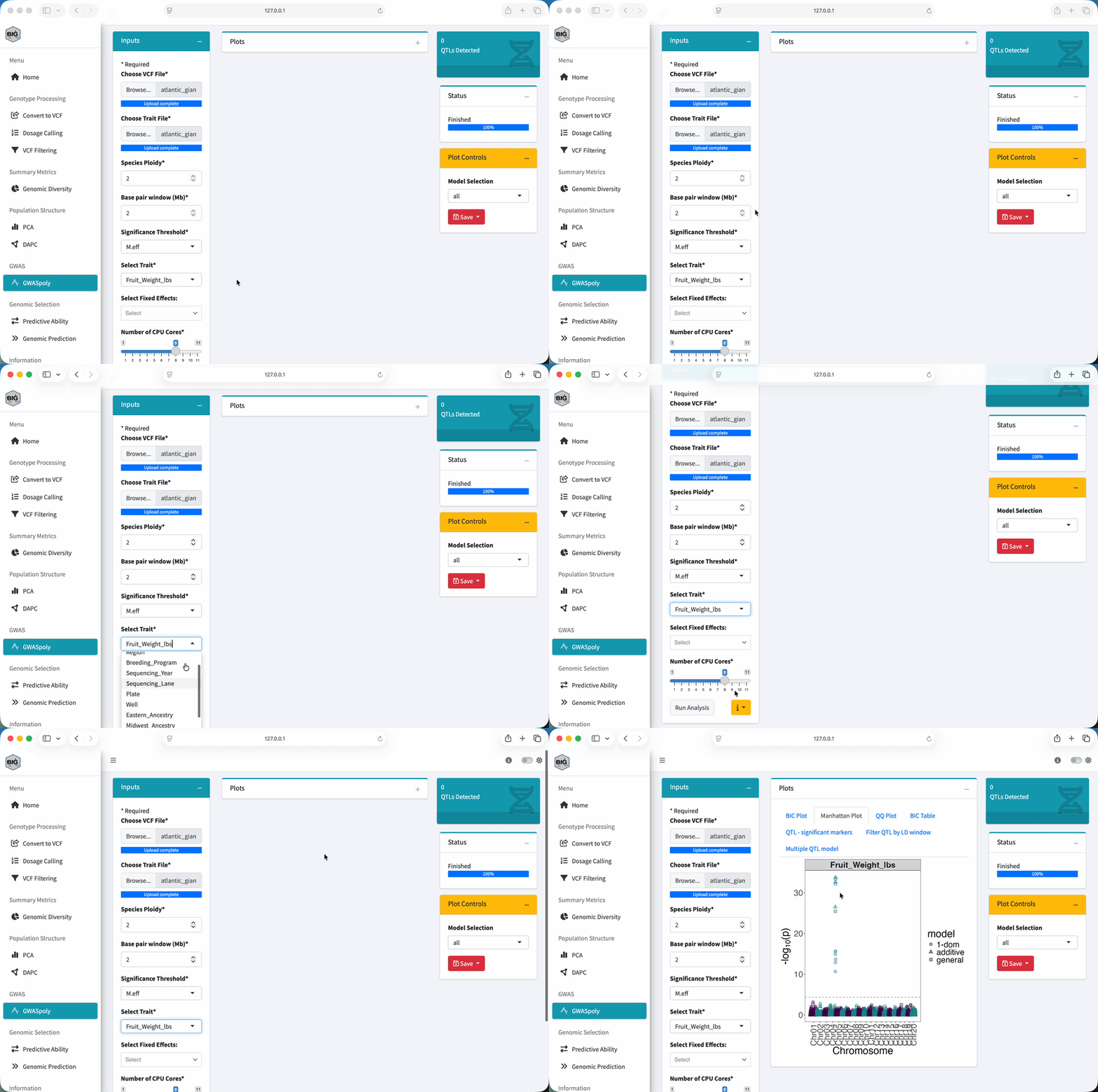
Steps:
- Go to “GWAS” in the sidebar
- Upload your VCF file (
atlantic_giant_pumpkin_diversity.vcf.gz) - Upload your phenotype file (
atlantic_giant_pumpkin_diversity_phenotypes.csv) - Select the trait to analyze
- Set your significance threshold
- Click Run GWAS
BIGapp will automatically determine the optimal number of PCs using BIC — you can view the BIC plot in the results tabs.
Try It Yourself
Using the pumpkin data:
- Navigate to the GWAS section
- Upload the phenotype file if not already loaded
- Select Fruit_Weight_lbs as the trait
- Run the analysis
- Check the BIC plot to see how many PCs were automatically selected
- Look at the Manhattan plot — do you see any significant peaks?
With the pumpkin dataset, you should see a clear peak on Chromosome 4 with multiple significant SNPs! This represents a QTL for fruit weight.
Interpreting Results
Significant Markers
Markers above the threshold line are your “hits.” For each significant marker, you’ll see:
| Info | What it tells you |
|---|---|
| Chromosome & Position | Where in the genome |
| P-value | How significant |
| Effect size | How much the allele changes the trait |
| MAF | How common the associated allele is |
What Makes a Good Hit?
✅ Clear peak (not just one marker, but a region)
✅ Biologically plausible location (near candidate genes)
✅ Consistent across environments/years
✅ Effect size that matters for breeding
Red Flags
⚠️ Single isolated marker (could be genotyping error)
⚠️ Low MAF marker (could be spurious)
⚠️ Inconsistent across analyses
⚠️ Too many significant markers (check population structure correction)
Understanding the Chromosome 4 Peak
In the pumpkin data, you’ll notice 3 significant SNPs clustered together on Chromosome 4. Does this mean there are 3 QTLs?
No! This is linkage disequilibrium (LD) in action.
| SNP | Distance from peak | Why it’s significant |
|---|---|---|
| SNP_0240 | 0 kb (the peak) | This is likely the causal variant |
| SNP_0239 | ~479 kb away | Significant due to LD with the causal SNP |
| SNP_0238 | ~858 kb away | Also in LD with the causal SNP |
Multiple significant SNPs in the same region usually represent ONE QTL, not multiple independent effects. The other SNPs are just “hitchhiking” because they’re correlated with the causal variant.
What would you do next?
- LD pruning/clumping — Keep only one SNP per LD block
- Fine-mapping — Use additional methods to pinpoint the causal variant
- Check the SNP info file — In this simulated dataset, we know SNP_0240 is the true causal variant!
The QQ Plot
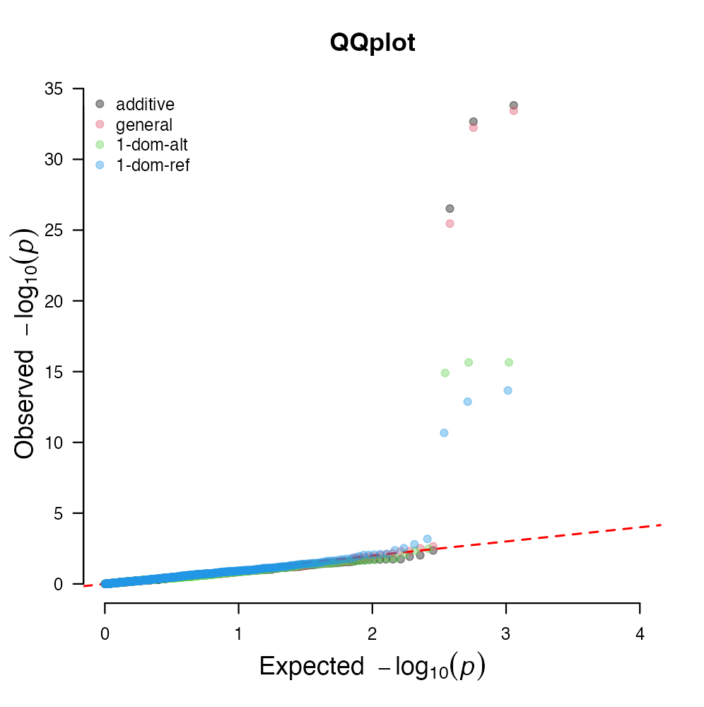
The QQ (quantile-quantile) plot helps you check if your GWAS is well-calibrated:
Reading the QQ Plot
- Diagonal line: What you’d expect if no markers were associated
- Points on the line: Good — no inflation
- Deviation at the tail: Expected — these are your true associations
- Deviation across all points: Problem — likely uncontrolled population structure
If points deviate from the diagonal across the whole range (not just the tail), add more PCs or check for other issues.
Polyploid GWAS
BIGapp uses GWASpoly for polyploid species, which handles the complexity of having more than two allele copies.
Diploid vs. Polyploid
| Ploidy | Possible genotypes | Example |
|---|---|---|
| Diploid (2x) | AA, AB, BB | Most crops |
| Tetraploid (4x) | AAAA, AAAB, AABB, ABBB, BBBB | Potato, alfalfa |
| Hexaploid (6x) | 7 possible genotypes | Wheat |
GWASpoly tests different genetic models to find associations:
- Additive: Each allele copy has equal effect
- Simplex dominant: One copy is enough for full effect
- Duplex dominant: Two copies needed for effect
- etc.
BIGapp tests multiple models and shows you which fits best.
From GWAS to Breeding
What Can You Do With GWAS Results?
| Application | How |
|---|---|
| Marker-assisted selection | Select for favorable alleles at significant markers |
| Candidate gene identification | Look for genes near significant markers |
| Understanding trait architecture | How many QTLs? Large or small effects? |
| Develop KASP markers | Convert significant SNPs to cheap screening assays |
Limitations
GWAS finds associations, not necessarily causal variants:
- The significant marker might be near the causal gene, not in it
- Rare variants with large effects may be missed
- Small-effect QTLs need large sample sizes to detect
Exercise
Using the pumpkin data:
- Run GWAS for Fruit_Weight_lbs
- Examine the Manhattan plot:
- How many significant peaks do you see?
- Which chromosome has the strongest association?
- Check the QQ plot:
- Does it look well-calibrated?
- Is there evidence of inflation?
- Look at the Chromosome 4 hits:
- How many significant SNPs are there?
- How close together are they?
You should see one clear peak on Chromosome 4 with 3 significant SNPs within ~858 kb of each other. The QQ plot should show points following the diagonal with deviation only at the tail (true associations). This represents a single QTL for fruit weight — the simulated causal variant (SNP_0240) adds ~150 lbs per alternate allele!
Discussion: - Why do 3 significant SNPs represent only 1 QTL? - How would you narrow down which SNP is causal? - What would you do before using these markers in a breeding program?
Key Takeaways
✅ GWAS finds markers associated with traits
✅ Manhattan plots show significance across the genome
✅ Population structure correction (PCs) prevents false positives
✅ QQ plots help diagnose problems
✅ BIGapp handles polyploid GWAS automatically
✅ GWAS hits are associations, not necessarily causal variants
Next (Optional): Module 4: Genomic Selection — Predicting breeding values from markers